 |
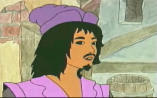
| Pierre Gringoire |
When a character speaks, their mouth and nose expand and shrink. When they walk, they're legs move scarcely past one another. It's just the bare minimum of effort.
Animation is recycled plenty of times. Each character has only a single walk cycle and lip syncing amounts to vague flaps of the mouth.
Artistically, Dingo Pictures' Hunchback is baffling. Buildings are nothing more than lopsided watercolor boxes. Proportions are laughably inconsistent. The colors are muted and frankly ugly. Lots of browns, purples, and yellows. It's just not very nice to look at.
Aside from Quasimodo, the character designs are far from derivative from the Disney film, surprisingly. That doesn't stop them, like the animation, from being unpleasant. Everyone, from Abbot Frollo to the "Crazy Old Lady," is repulsive. Quasimodo is far from out of place in this society.
 |
| Not only are the buildings inconsistent, but also historically inaccurate. Is that the Eiffel tower on the left? |
 |
| Here, Quasimodo is taller than Frollo and the tower of Notre Dame |
This wouldn't even pass for an animatic.
No comments:
Post a Comment